
3D Puff Embroidery: 7 Design Rules That Prevent Collapsed Edges
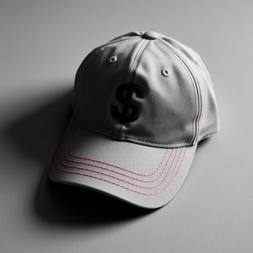
3D puff embroidery — raised lettering stitched over foam — is the most requested premium finish in headwear, and the most frequently botched. When puff works, it looks sculptural. When it fails, edges collapse, foam peeks through thread, and letters look chewed. The difference is almost never the machine; it’s the design and the digitizing. Here are the seven rules we apply to every puff project, learned across thousands of cap runs.
How 3D Puff Actually Works
A sheet of EVA foam is laid on the cap, and satin stitches are sewn straight through it with higher-than-normal density. The stitching compresses and cuts the foam at the edges; the excess tears away, leaving thread-wrapped foam standing 2–3mm proud of the fabric. Every rule below follows from that mechanic: the stitches must fully wrap and cleanly cut the foam.
Rule 1: Respect Minimum Stroke Width
Puff needs meat. Strokes narrower than about 4mm can’t hold enough foam to read as raised, and strokes wider than about 12mm let the satin stitches sag and snag. Bold, chunky letterforms — varsity block, heavy slab — are puff’s natural habitat. Thin scripts and hairline serifs are not.
Rule 2: Choose Letterforms Without Sharp Interior Corners
Foam tears away cleanly along stitched edges — but sharp interior corners (the crotch of an “M”, tight counters in “B”) trap foam fragments that stitching can’t cut. Rounded joins and open counters tear clean. When a brand font has problem corners, we subtly adjust the digitized letterforms so the stitched result stays faithful and production-safe.
Rule 3: Cap the Edges Properly
Every puff element needs capping stitches — walking stitches at the ends of satin columns that cut the foam and stop it from creeping out at the tips. Skipped capping is the #1 cause of “foam whiskers” on finished caps. If you’ve seen white foam poking from letter ends, you’ve seen a file without caps.
Rule 4: Increase Density — but Only Over Foam
Puff satin needs roughly 1.5–2× standard density to fully cover foam walls. But that density applied to flat elements of the same design creates bulletproof patches and thread breaks. Mixed flat/puff designs must be digitized as two logical layers with independent settings — one more reason generic auto-digitizing fails at puff.
Rule 5: Sequence Flat First, Puff Last
Foam goes on late in the run. Any flat detail stitched after the foam is placed will either stitch onto foam or force a mid-run stop. Correct puff files sequence all flat elements first, pause for foam placement, then run the raised elements. On multi-head machines, that sequencing discipline is the difference between smooth production and operator misery.
Rule 6: Design for the Curve
Cap fronts are curved and seamed. Puff amplifies both problems:
- Keep raised elements within the sweet zone — roughly 60mm tall on a standard structured crown
- Stitch center-out so distortion pushes toward the edges (see our digitizing explainer for why sequence controls distortion)
- Avoid running puff across the center seam of unstructured caps; the seam telegraphs through raised foam
Rule 7: Match Foam Color to Thread
Even a perfectly cut edge can flash a hairline of foam at extreme angles. Colored foam under matching thread makes that invisible; white foam under black thread makes it glaring. It’s a fifty-cent decision that separates professional from amateur output.
Quick pre-flight: bold letterforms ≥4mm strokes · rounded interior corners · capped column ends · 1.5–2× density on puff only · flat-then-puff sequence · center-out pathing · foam matched to thread. Seven checks, zero collapsed edges.
On the Machine: Production Notes That Protect the Design
Even a perfectly digitized puff file can be let down at the machine. Share these notes with your operator (or your embroiderer):
- Foam thickness: 2mm is the versatile standard; 3mm reads dramatically but demands wider strokes and higher density. Don’t swap thickness without adjusting the file.
- Needle choice: a sharp 75/11 or 80/12 cuts foam cleanly; ballpoint needles push foam instead of piercing it, leaving ragged walls.
- Tension: slightly looser top tension lets satin stitches wrap the foam’s shoulders instead of strangling it flat.
- Placement: foam should overhang the design area generously — skimpy foam placement causes bare tips when the fabric shifts.
- Tear-away technique: remove excess foam with a swift pull along the stitch line, then hit remaining fragments with a heat gun’s quick pass; heat shrinks stray foam invisible.
Speed matters more than usual
Puff runs best 20–30% slower than flat embroidery — around 600–650 SPM on most commercial machines. High speed deflects the needle through foam and drifts registration. The stitch count is lower than an equivalent fill design anyway; the slower speed rarely costs real time.
Beyond Caps: Where Else Puff Earns Its Keep
Headwear is puff’s home turf, but the technique travels:
- Hoodies and crewnecks: chest-center puff wordmarks are a streetwear staple — use cutaway backing and respect the fabric’s stretch
- Beanies: small, bold puff marks work brilliantly on cuffed knits; keep designs compact and away from the fold line
- Varsity jackets: puff pairs naturally with appliqué — foam letters over twill panels create two-level dimension
- Bags and totes: stable canvas holds puff crisply; it’s an underused premium touch on merch
The constant across all of them: puff is a headline technique. One raised element with clean flat support reads premium; an entire design in puff reads like a pillow fight. Restraint is the style.
Frequently Asked Questions
Can any logo be done in 3D puff?
Most logos need adaptation — usually bolding strokes and simplifying detail. A common premium approach is a hybrid: main mark in puff, fine details in flat embroidery beside it.
Does puff cost more to digitize and run?
Somewhat: higher density means more stitches, plus foam placement time. On typical cap logos the difference is modest, and the perceived value increase is far larger.
What caps work best for puff?
Structured caps with firm buckram fronts — snapbacks, trucker fronts, varsity styles. Unstructured dad caps accept puff but need lighter designs away from the center seam.
Why do my puff letter tips look ragged?
Almost always missing capping stitches or under-density at column ends — a digitizing fix, not a machine fix, and one of the most common repairs we make to files digitized elsewhere. Send us the file; we’ll diagnose it free.
How much extra should I budget for puff versus flat embroidery?
For a typical cap-front logo, expect a modest premium on digitizing (the file genuinely takes more skill) and a small per-piece uplift for foam material and slightly slower run speeds. In practice most clients see total decoration cost rise 15–30% — against a perceived retail value increase that’s usually far larger. Where budgets are tight, the hybrid approach (one puff element, rest flat) captures most of the visual impact at a fraction of the premium.
Preparing a Logo for Its Puff Debut: A Worked Example
Here’s how a typical brand mark gets adapted, using a composite of dozens of cap projects we’ve run:
- The source: a three-letter monogram with a thin circular border, a small tagline underneath, and moderate-weight letterforms.
- Decision 1 — what puffs: only the monogram. The circle border (1.5mm stroke) and the tagline (2.8mm letters) are physically impossible in foam; they stay flat embroidery.
- Decision 2 — bolding: the monogram’s strokes measure 3.2mm at target size. We thicken them to 4.5mm — enough foam to read as raised, subtle enough that the brand team sees “their” letters.
- Decision 3 — corner surgery: the “A” crossbar creates two tight interior corners. We open them by a fraction of a millimeter each — invisible in the final cap, decisive for clean foam tearing.
- Decision 4 — the tagline call: at cap scale, the tagline would stitch at 2.8mm — below the legibility floor. We present two options: drop it, or move it to the cap’s side panel at proper size. (Nine clients in ten choose the side panel and end up preferring it.)
- The file: flat elements sequenced first, machine pause for foam, puff elements center-out with capping, densities layered per element. Stitch-tested on a structured blank in the client’s cap color before delivery.
Total adaptation time: under a day. The difference between this and feeding the flat logo into puff settings blindly is the difference between a cap your client photographs for Instagram and one they quietly never reorder.
What to send your digitizer for a puff quote
Three things speed everything up: the vector logo (or best available artwork), the target cap style (structured or unstructured — it changes the design ceiling), and the finished size you want. With those in hand, a same-day turnaround is realistic for most cap-front designs.
Conclusion
3D puff rewards discipline. Bold shapes, clean corners, capped edges, layered densities, and smart sequencing produce caps that look carved rather than stitched. Every puff file we deliver is stitch-tested on an actual cap before it ships — so your first run comes out raised, crisp, and clean. Planning a headwear drop? Get a free puff-readiness check on your logo.
The newsletter
Stay Updated With
Industry Insights.
Get the latest embroidery tips, vector design techniques, production advice, and business resources delivered directly to your inbox. One useful email — no spam, ever.
Unsubscribe anytime. We respect your inbox and your data.