How to Prepare Artwork for DTF Printing: A Pre-Press Checklist
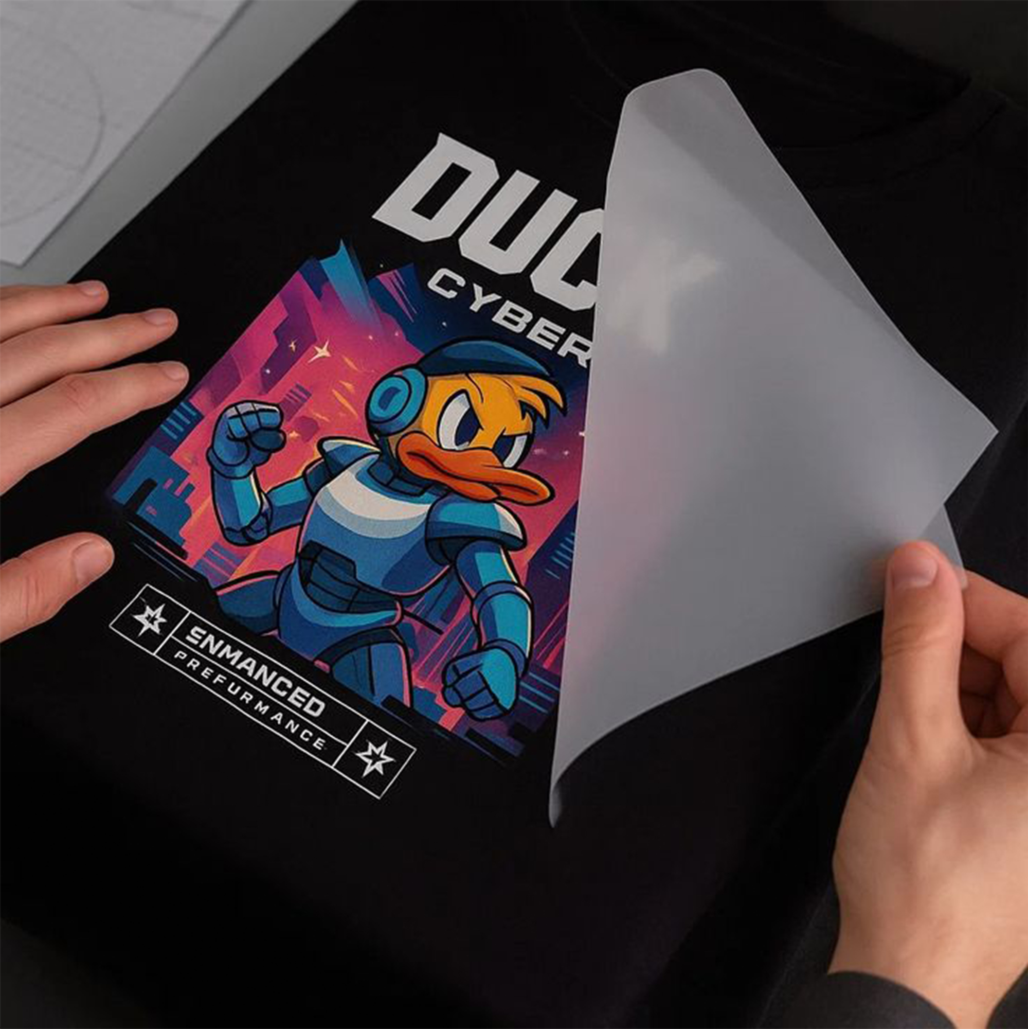
DTF (direct-to-film) printing has earned its boom: vibrant color, no weeding, works on cotton, poly, blends, and dark garments alike. But DTF is only as good as the artwork fed into it — and most “bad transfer” complaints trace back to files, not printers. Here is the exact pre-press checklist we run on every piece of DTF artwork before it’s declared production-ready.
Why DTF Is Unforgiving of Weak Artwork
A DTF transfer prints exactly what’s in the file — every soft edge, every compression artifact, every stray semi-transparent pixel — then bonds it to fabric behind a layer of white ink. Screen printing’s ink spread can hide small sins; DTF reproduces them in high fidelity. Clean input isn’t optional; it’s the process.
The Pre-Press Checklist
1. Resolution: 300 DPI at print size
Not 300 DPI at some size — at the final printed dimensions. A 3000×3000px image is 300 DPI at 10 inches, but only 150 DPI at 20 inches. Upscaling a small file doesn’t add detail; it adds soft mush. When source art is too small, the fix is redrawing or vector conversion, not resampling.
2. True transparent background
DTF prints white ink wherever pixels exist. A “white background” that looks invisible on screen prints as a solid white rectangle on garment. Requirements:
- PNG (or TIFF) with genuine alpha transparency — never JPEG, which has no transparency at all
- No leftover halo pixels from sloppy background removal — zoom to 400% and inspect edges
- No semi-transparent shadows unless you truly want them printed (they render as speckled white-backed dots)
3. Hard edges beat feathered edges
Soft, feathered, or glowing edges produce ragged transfer borders where partially transparent pixels get white underbase. Either harden edges to full opacity, or design the fade as a halftone — converting gradients-to-nothing into dot patterns of fully opaque pixels that fade visually but print cleanly.
4. Color: work in the right space
- Deliver sRGB unless your printer requests otherwise (most DTF RIPs expect it)
- Expect neon and ultra-saturated screen colors to shift; they exceed CMYK+White gamut
- Critical brand colors deserve a printed swatch test before a big run — ink, film, and fabric all shift the result
5. Mind minimum detail sizes
- Line work: keep strokes above ~1pt at print size; hairlines flake at the edges after washing
- Text: 6pt is a practical floor for legibility and durability; negative (knockout) text needs to be bolder still
- Isolated small dots and floating specks wash off first — remove or thicken them
6. Size and orient for the garment, not the file
Standard adult front prints run 10–12 inches wide; left chest 3.5–4 inches; youth sizes proportionally smaller. Build the file at final size so nothing is left to press-side interpretation — and name files clearly (design-front-11in.png beats final_v3_REAL.png every time).
60-second pre-flight: 300 DPI at print size · true alpha transparency · no halos or feathered fades · sRGB color · strokes ≥1pt, text ≥6pt · sized and named for the press. Six checks that eliminate 95% of transfer failures.
Gradient and Shadow Strategies That Survive the Wash
Gradients between two solid colors print beautifully. Gradients to transparency are the trap. Three production-safe approaches:
- Halftone the fade — the classic, and it reads as intentional style
- End the gradient on a solid color, then hard-edge the shape
- Contain fades inside a solid-edged frame so the transfer’s border is always full opacity
Understanding the Process Helps You Prep for It
A 60-second tour of what happens to your file, because each stage explains a checklist rule:
- Print: a modified inkjet prints your artwork mirrored onto PET film — CMYK color first, then a white ink layer over every printed pixel. (This is why stray pixels and false transparency matter: white ink faithfully backs them all.)
- Powder: hot-melt adhesive powder is applied to the wet ink and shaken off the blank areas. (Why hard edges matter: powder clings to every semi-transparent speck.)
- Cure: the film passes through an oven, gelling the adhesive.
- Press: film meets garment at ~150°C for 10–15 seconds; after cooling, the film peels away leaving the transfer bonded. (Why detail floors matter: micro-thin elements have micro-thin adhesive and lift first.)
Gang Sheets: The Money Question
DTF is priced by film area, which makes gang sheets — multiple designs tiled onto one large sheet — the single best cost lever. Prep rules for ganging:
- Build each design at its exact print size before placing it on the sheet
- Leave at least 0.5″ between designs for clean cutting
- Group by garment type if pressing settings differ
- Include size labels outside each design’s cut zone — future you, sorting 40 transfers, says thanks
- Mixed-size strategy: fill gaps around large front prints with left-chest and sleeve versions of the same logo
Cost math: a 22×60″ gang sheet holding 12 assorted designs typically costs less than half the per-transfer price of ordering those designs individually. Artwork prepped at final size makes ganging a five-minute job instead of a rework loop.
Durability: What Makes a Transfer Survive 50 Washes
Wash longevity is decided by four factors, in descending order of blame when things fail:
- Press execution — temperature, pressure, and dwell within spec, plus a proper cold or hot peel per film type
- Artwork structure — the detail floors above; thin isolated elements crack and lift first
- Film and powder quality — commodity film saves cents and costs reputations
- Garment care — inside-out, cold wash, low-heat dry roughly doubles transfer life
Notice artwork is second on the list. Half of “durability problems” are design problems that no press settings can rescue — which is exactly what the pre-press checklist exists to catch.
Frequently Asked Questions
Can you make my low-res logo DTF-ready?
Yes — that’s exactly our DTF artwork preparation service. We redraw, clean edges, fix transparency, and deliver sized, press-ready PNGs, usually the same day.
Does DTF work on both light and dark garments?
Yes — the white ink underbase makes colors pop on darks. That same underbase is why transparency hygiene matters so much.
DTF or embroidery for my logo?
Different tools: DTF excels at photographic detail, gradients, and low-cost color; embroidery brings texture and premium perception. Many brands use both — DTF for tees, embroidery for caps and polos. We prepare artwork for either from the same master.
What file should I send my print shop?
A PNG with transparency, 300 DPI at final print size, sRGB. Ask your shop if they want a specific color profile — good shops will tell you.
Why does my transfer look great pressed but crack after a few washes?
Work down the durability list above in order: verify press temperature and dwell with heat-tape strips (press thermostats drift), check whether the failing areas are thin isolated details (an artwork fix), then question the film stock. Cracking concentrated along fold lines of very large solid prints is a different issue — oversized solid blocks fight the fabric’s stretch, and breaking them up with design texture or halftones relieves the stress.
Do I need different artwork for light and dark garments?
Usually not — the white underbase makes one file work on both. The exception is artwork containing white or very light elements with no outline: on white garments those elements vanish. A thin contrasting keyline solves it, letting a single prepared file serve the whole garment color range.
DTF Against the Field: When It’s the Right Call
The checklist assumes DTF is your method — worth pressure-testing that assumption:
- DTF vs. screen print: screen printing wins on very large runs of simple designs (its setup cost amortizes; its per-piece cost floors lower). DTF wins on multicolor complexity, short runs, mixed sizes, and no-minimum flexibility. The crossover point for most shops sits around 50–100 pieces of a multicolor design.
- DTF vs. DTG: DTG prints directly into the garment fiber for the softest hand, but demands cotton-heavy fabrics and pretreatment. DTF’s film transfer works on nearly anything — poly blends, nylon, canvas — with more consistent color on darks. Feel favors DTG; versatility favors DTF.
- DTF vs. embroidery: not really competitors — perception tiers. Thread signals durability and premium positioning (caps, polos, outerwear); DTF delivers photographic color economically (tees, event wear, fashion graphics). The strongest merch programs deliberately use both, from one shared master file.
- DTF vs. HTV vinyl: vinyl still suits single-color names-and-numbers at tiny volumes, but DTF has effectively absorbed vinyl’s multicolor territory — no weeding, no layering, faster application.
Questions your print shop wishes you’d ask
A two-minute conversation before sending files prevents most production surprises: What color profile does your RIP expect? Hot peel or cold peel film? What’s your maximum print width? Do you prefer single designs or pre-built gang sheets? Any shop worth your volume answers these happily — and a shop that can’t answer them is telling you something more important.
Conclusion
Great DTF is decided before the printer wakes up. Resolution at size, honest transparency, hard or halftoned edges, and realistic color expectations turn transfers from a gamble into a production line. Want your artwork made press-ready by people who prep files for a living? Send it over — same-day DTF preparation is one of our specialties.
The newsletter
Stay Updated With
Industry Insights.
Get the latest embroidery tips, vector design techniques, production advice, and business resources delivered directly to your inbox. One useful email — no spam, ever.
Unsubscribe anytime. We respect your inbox and your data.