Left Chest Logo Size Guide: Getting Placement and Scale Right
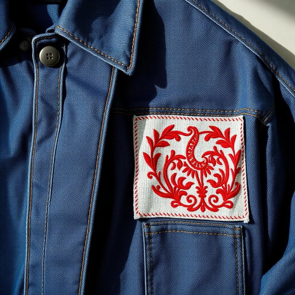
“Just put it on the left chest” hides two real decisions: how big, and exactly where. Get them right and the garment looks uniform-grade professional; get them wrong by half an inch and everyone senses it without knowing why. This guide covers the sizing standards, placement measurements, and garment-by-garment adjustments we apply across thousands of left chest jobs.
The Standard: 3.5 Inches — and When to Break It
The industry default for a left chest logo is 3.5″ wide (89mm), with a working range of 3″–4″. It’s a default, not a law. The right size depends on the logo’s shape:
- Horizontal logos (wide wordmarks): 3.5″–4″ wide, height following naturally
- Square/circular marks: 3″–3.5″ in both dimensions — a 4″ circle overwhelms a chest
- Vertical/stacked logos: cap the height at about 3.5″ and let width fall where it may
- Text-heavy logos: size up until the smallest lettering clears 4mm tall (the embroidery legibility floor), then simplify if it still doesn’t fit — see why in our digitizing guide
Placement: Where “Left Chest” Actually Is
The reference points are the shoulder seam, the center front, and the armhole. The classic target:
- Vertical: 7″–9″ down from the left shoulder seam — roughly level with the fullest part of the chest
- Horizontal: centered between center-front (placket) and the side seam — typically 4″–6″ from center on adult garments
- The quick operator’s check: the logo center sits a touch above and outside the wearer’s heart
Shop shortcut: a placement ruler (or a simple card template with a cut-out window) beats measuring every garment. Consistency across a batch matters more than absolute perfection on one piece.
Garment-by-Garment Adjustments
Polos
The baseline case. Align the logo’s vertical position with the second placket button as a sanity check. Piqué knit needs proper underlay or the design sinks — a digitizing setting, not a placement one.
Button-up shirts
Pockets change everything. Logo on the pocket: max ~3″ wide, centered on the pocket. No pocket: standard rules apply, but mind stripe patterns — align the logo level with the stripe, never slightly off it.
Jackets and outerwear
Bulkier garments carry bigger marks: 3.75″–4.25″ reads correctly on a heavy softshell. Watch for zippers and seam tape shifting the available field; measure from the wearer’s perspective, not the flat garment.
Hoodies and fleece
Fleece swallows detail. Size up ~10% and insist on lofty underlay. If there’s a front pocket, keep 1.5″ clearance above it.
Youth sizes
Scale down: 2.5″–3″ wide, placed 5″–7″ from the shoulder seam. An adult-size logo on a youth small looks like a billboard.
Performance wear
Lightweight technical knits pucker under dense embroidery. Keep marks at 3″–3.25″, request reduced density digitizing, and consider a one-color version of complex logos.
Sizing the Logo’s Content, Not Just Its Box
Two logos both “3.5 inches wide” can carry wildly different detail loads. Before locking size, check the smallest element:
- Lettering below 4mm tall will blur — enlarge the logo, or drop the tagline
- Strokes and gaps below ~1mm will bridge together in thread
- Fine details that survive print routinely die at left-chest scale; a simplified “embroidery version” of the brand mark is standard practice at serious brands
Hooping and Stabilizing for Placement Accuracy
Placement rules are only as good as the hooping that executes them. The failure mode is familiar: measured perfectly flat, stitched 15 degrees rotated because the garment shifted in the hoop.
- Mark before hooping: tailor’s chalk cross or an air-erasable pen at the logo center, measured per the numbers above
- Use a hooping station for any batch over a dozen pieces — repeatability beats individual perfection
- Match stabilizer to fabric: cutaway for knits and anything stretchy (polos, performance wear), tearaway for stable wovens, plus a water-soluble topping on piqué and fleece to stop stitches sinking
- Hoop taut, not stretched: a knit stretched in the hoop relaxes after unhooping and puckers around the design permanently
- Verify needle start point against your chalk mark before pressing start — the five-second check that saves garments
Beyond One Logo: Multi-Position Layouts
Uniform programs rarely stop at a single mark. The standard grammar of garment positions:
- Left chest: the brand logo — the anchor of the layout
- Right chest: wearer name, title, or certification; sized slightly smaller than the logo (2.5″–3.5″) so hierarchy reads correctly
- Left sleeve: flags, department badges, or secondary marks — 2″–3″, centered 1″–1.5″ below the shoulder seam
- Back yoke (below collar): wordmarks and URLs, 6″–10″ wide, top edge 1.5″–2″ below the collar seam
- Full back: statement territory, 10″–12″ wide — where appliqué construction starts making economic sense
The professional habit that ties it together: a one-page placement spec sheet per client — positions, sizes, thread colors, and reference photos. It makes every reorder identical regardless of which operator runs it, and clients notice the consistency even when they can’t name it.
Frequently Asked Questions
Left chest as the wearer sees it, or as I look at the shirt?
The wearer’s left — over the heart. When you’re facing the garment, that’s the right side of your view. Yes, every shop has stitched a batch backwards once; templates prevent it.
What about right chest placement?
Common for names, titles, and secondary marks, mirrored to the same measurements. Pairing a left-chest logo with right-chest personalization is a classic uniform layout.
Do these rules apply to DTF or screen print?
Placement, yes. Sizing floors differ — print holds smaller detail than thread. See our DTF artwork checklist for print-side minimums.
Can you resize my existing embroidery file?
Within about ±10%, usually. Beyond that, density and detail decisions need re-digitizing from the master file — send it over and we’ll advise honestly.
Where do monograms and names go, if not the left chest?
Personal monograms follow different traditions: shirt cuffs, collar points, or the classic pocket placement for dress shirts, and the right chest for names on uniforms and workwear. Keep personalization visually subordinate to the brand mark — smaller, often tone-on-tone — so the garment reads as branded first, personalized second. For team gear, a consistent name position across every garment matters more than which position you choose. When in doubt, mock the layout on one garment and photograph it worn — placement decisions made on bodies survive; decisions made on tables get revised.
Troubleshooting Placement Problems After the Fact
Even disciplined shops occasionally face a batch that looks subtly wrong. Diagnosing the usual suspects:
- Logos look straight on the table, crooked when worn: you aligned to the garment’s hem or side seam instead of the shoulder seam. Garments hang from the shoulders; that seam is the truth reference.
- Consistent batch, but everything sits low: measurement taken with the garment stretched flat on the hooping station. Measure garments relaxed, as they hang.
- Placement varies across sizes in the same order: a fixed measurement was applied from S through 3XL. Placement should scale — roughly a half inch of additional drop and outset between a small and a 2XL. A per-size row on your spec sheet fixes this permanently.
- Logo tilts on one side of a zip-up but not the other: the placket’s bulk shifted the hooping. Hoop with the zipper fully closed and centered, and mark from the wearer’s chest plane, not the placket edge.
- Design distorts within itself (placement fine, logo warped): that’s not placement — that’s the file. Density and compensation problems masquerade as placement issues constantly; see our bad-file diagnostic.
When a client insists on non-standard placement
It happens: the founder wants the logo centered, or enormous, or over the pocket seam. Produce one sample garment their way and one to standard, photograph both worn (not flat), and let them choose with eyes open. Nine times out of ten the standard wins on the body; the tenth time, you’ve documented that the choice was theirs. Samples are cheaper than arguments — a theme across everything in this trade.
Conclusion
Left chest work is a discipline of small numbers: 3.5 inches, 7–9 down, 4–6 across, 4mm minimum lettering. Nail them consistently and every garment leaves your shop looking deliberate. Want a logo package pre-built to these standards — sized variants, digitized, machine-tested? Request a free quote and we’ll prepare the full set.
The newsletter
Stay Updated With
Industry Insights.
Get the latest embroidery tips, vector design techniques, production advice, and business resources delivered directly to your inbox. One useful email — no spam, ever.
Unsubscribe anytime. We respect your inbox and your data.